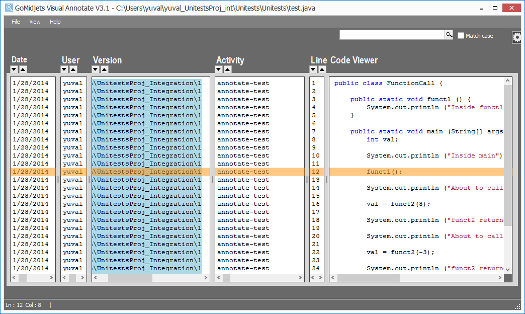
Visual Annotate‘s form displays a lot of info in correlation to code lines. Sometimes it’s quite difficult to track (visually) what date, user, version or activity is associated with a certain code line. That’s why we provided the option to use bold and zigzag cursors in the past. The problem with that was that the response time when hovering on the text, was sometimes horrible due to technical restrictions out of our hand.
We now provide a new light-weight feature that replaces this cursor. It colors the relevant line with a horizontal transparency marker. This provides much better response time and doesn’t override the colors when marking out a colored text (e.g. reserved words on text in a column that was already colored, e.g. Version column in the figure above)
To operate this, just click with the mouse on a relevant line. To remove it, click again.
This feature will be available in version 3.2. To evaluate Visual Annotate now, click here.


